Perfect White Paints and When to Use Them
Let’s talk about white. Aside from gray, white is probably the most stressed about color choice in our homes. Why? For lots of reasons, but it starts with undertones. Pick the wrong complementary color, and your “white” trim suddenly looks pink, yellow, or green. The stuff nightmares are made of—at least interior designer nightmares.
It’s not just complementary colors, either. Where the white paint is located in your home in relationship to natural light can make a difference. For example, white in a dark “cavernous” room will look different than in a space filled with natural light.
Even though a shade of white looks, well…white…there’s a lot more to it. Lay a handful of white paint swatches next to each other, and you’ll quickly see there is a difference. You’ll start to see undertones and whether this shade of white leans warm or cool.
What are warm and cool tones? Exactly that. Warm tones will feel creamy and warm, while a cool tone will feel stark and cold.
So, how do you pick the perfect shade of white? An easy place to start is deciding if you want your space to give off those warm or cool vibes. If you’re looking for a rustic or maybe even Spanish-style design, warmer tones will be your choice. On the other hand, if you’re looking for modern or mid-century, then a cooler white might be a better fit.
Next, look at natural light. Is the room filled with natural light most of the day, or are you relying on artificial light? If you’re flooded with natural light, look for a warmer or neutral selection.
Finally, look at what’s around it. The primary wall color, the floors, furniture, rugs, etc. What tones dominate these pieces? Are blues and greens dominating your space? Pick a cool, crisp shade of white. What if you have a lot of reds or yellows? You guessed it, pick a warm shade of white.
Pro Tip: Never rely on your computer or iPhone screen when picking out paint colors. Get a paint swatch and view it in your room. Also, don’t take one look and walk away. See how the color looks throughout the day as the amount of natural and artificial light shifts.
Are you feeling totally overwhelmed? I get it. When in doubt, pick a white that is as close to neutral as possible. Meaning it’s fool-proof when trying to blend it with other colors.
Here are a few of my favorite fool-proof neutral white paint colors:

Sherwin-Williams Alabaster SW 7008

Benjamin Moore White Dove OC-17
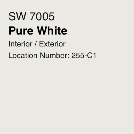
Sherwin-Williams Pure White SW 7005

Sherwin-Williams Snowbound SW 7004

Benjamin Moore Pure White OC-64

Benjamin Moore Simply White OC-117
Still overwhelmed? Book a color consultation, and we’ll do the decision-making for you. Learn more.
